Inflation, Supply & Demand, and Eggs: Part V

In the latest installment of the series (Part IV), we took a broad look at descriptive statistics, focusing on their role in summarizing what happened and why. We introduced the box plot as a powerful tool for visualizing distributions and demonstrated how to interpret its results. Using box plots, we re-examined the original time series from Part I, offering a fresh perspective on historical trends and showing the importance of deliberately removing the time dimension when working with time series data.
While box plots are incredibly useful for univariate analysis (summarizing a single variable), they are limited when it comes to understanding how variables interact within a dynamic system. To move beyond individual variables and explore their relationships, we’ll introduce a new tool: correlation. Correlation allows us to measure and quantify the strength of relationships between variables we identified and defined in Part II and Part III, offering a first step into understanding their interdependence.
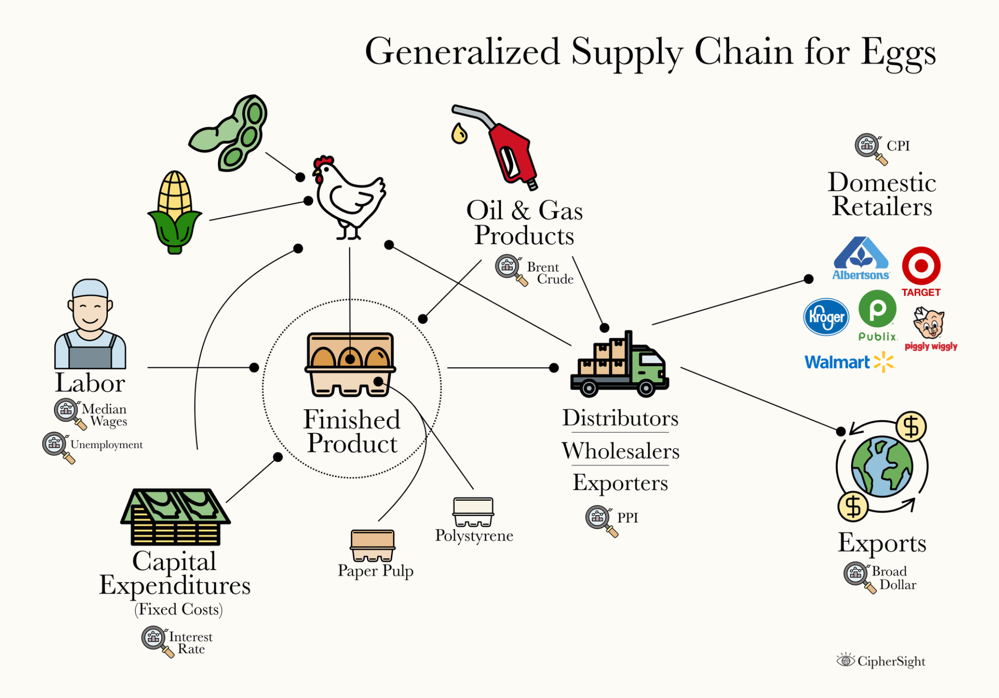
For context and reference, I'll also re-post a graphical generalized supply chain for eggs below:
Correlation
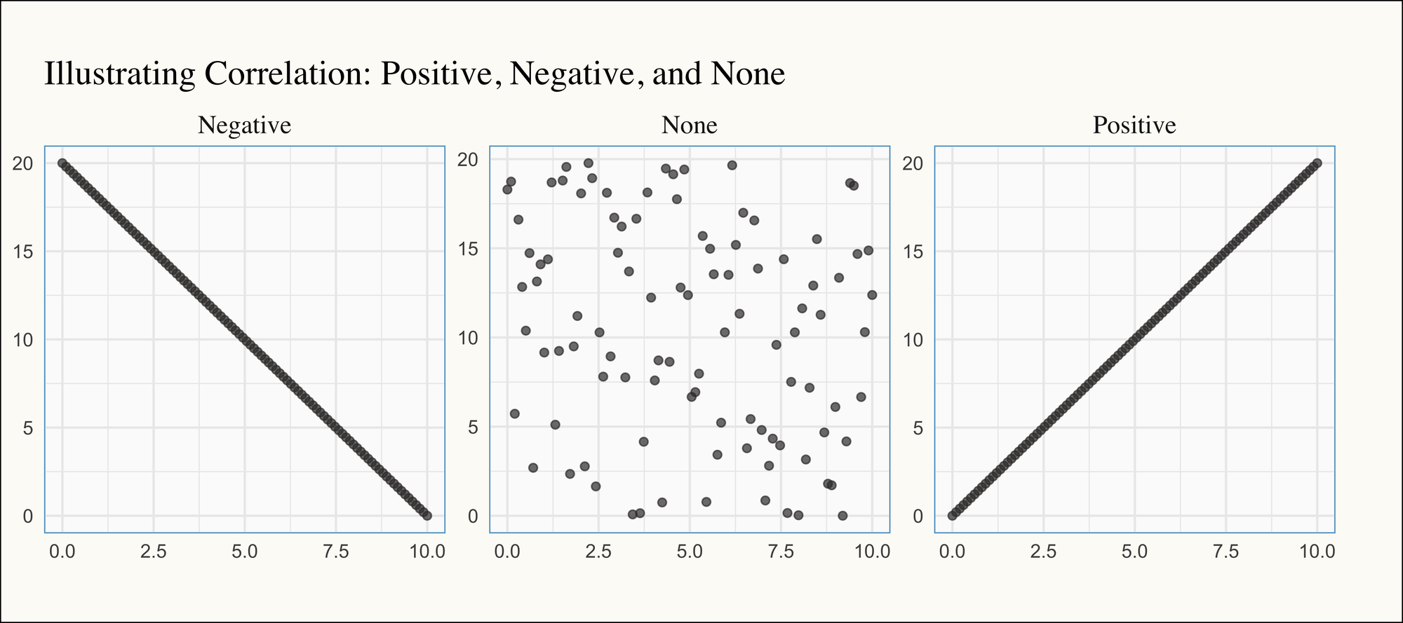
In its simplest form, correlation measures how two variables are related to each other. If there’s a positive correlation, the variables move up and down together—when one increases, so does the other. Conversely, if there’s a negative correlation, the variables move in opposite directions—when one increases, the other decreases (and vice versa). If there’s no correlation, the variables are unrelated, with no discernible pattern between their movements. Below, we illustrate what perfect positive correlation (i.e., 1), perfect negative correlation (i.e., -1), and no correlation (i.e., 0) look like graphically:
Trying to calculate and track correlation for every pair of variables individually would quickly become overwhelming. Thankfully, we can use a correlation matrix, which organizes all the correlation coefficients (-1 to 1) into a single, cohesive chart. This provides a bird's-eye view of the relationships between variables, making it much easier to identify patterns and insights at a glance:
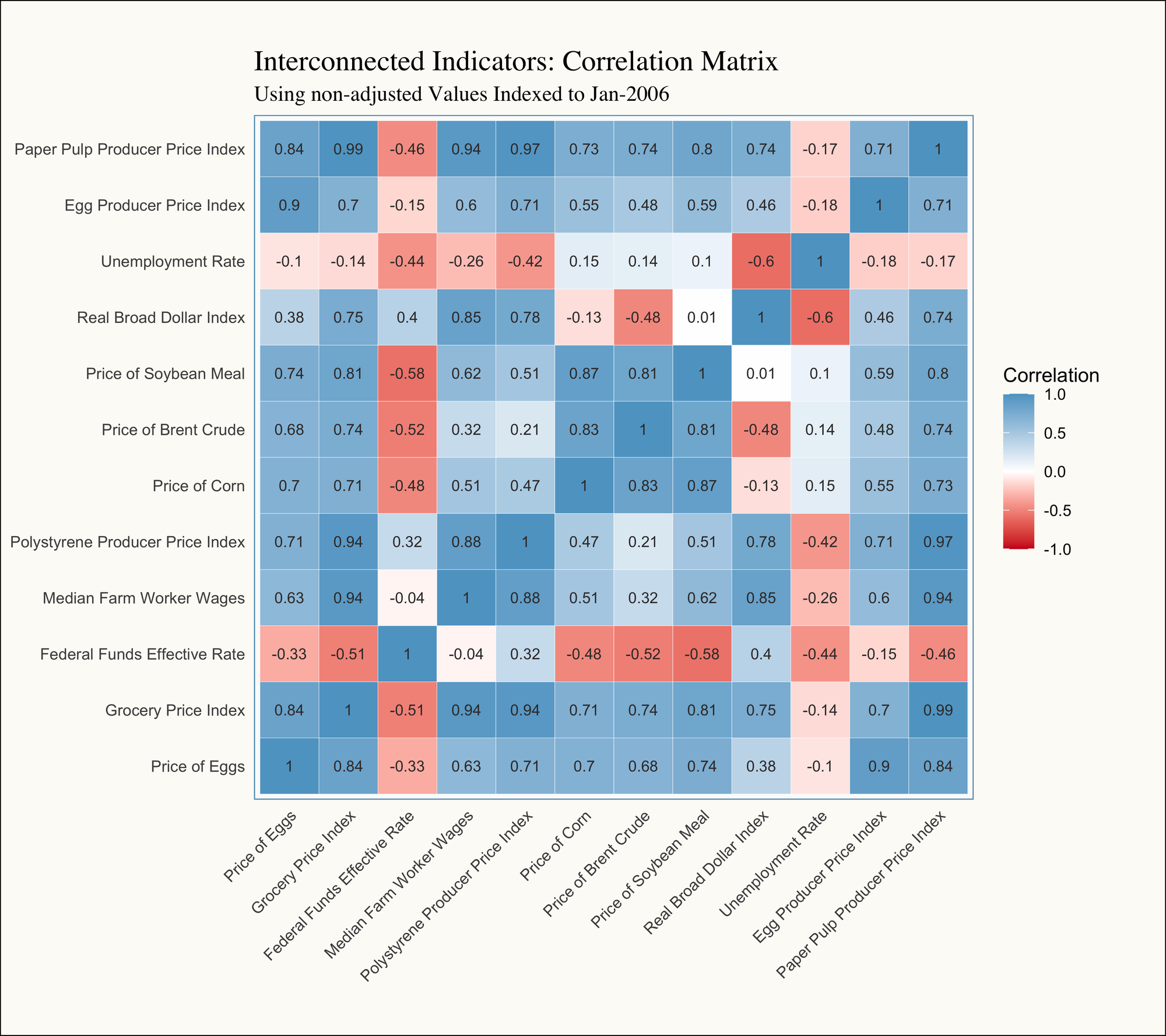
As a rule of thumb, we can evaluate the strength of the correlation by looking at the absolute value (doesn't matter if it's negative or positive):
- Less than 0.3: There is little to no linear relationship between the variables.
- Between 0.3 and 0.7: There is a moderate and noticeable linear relationship, but may not be consistent.
- Greater than 0.7: There is a strong and reliable linear relationship between the variables.
- The diagonal will always be 1: The variables will always be perfectly correlated to themselves.
Given that information, the number of moderate and strong relationships practically leaps off the page! However, this brings us face-to-face with one of the three key challenges—or "horsemen"—of time series analysis: Trend, Seasonality, and Cyclicality.
Spurious Correlation & De-Trending
One of my forecasting professors once mentioned in class that his age was almost perfectly correlated with GDP (Gross Domestic Product). I think about this often when working with time series data because it’s such a perfect example of how time trends can create the illusion of correlation. Not to spoil the surprise, but a single person’s age doesn’t impact GDP. However, because both variables tend to increase over time (a person ages one year every year, and GDP generally grows over time), age—and by extension, the passage of time—becomes a confounding variable in modeling GDP. This highlights the importance of accounting for time trends in any meaningful analysis to avoid spurious relationships.
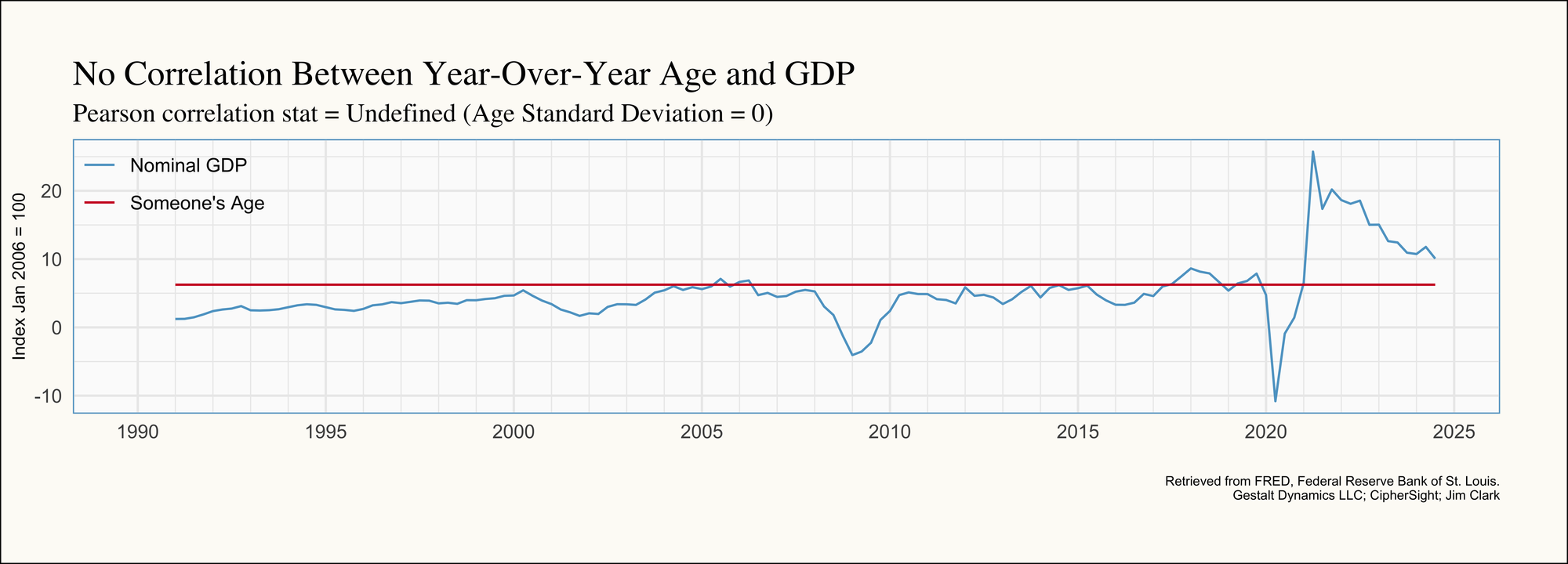
Below is an example of this in action: the age of someone born in January 1990 is almost perfectly correlated with GDP growth over time. Both variables have been re-indexed to January 2006 to facilitate an easier graphical comparison:
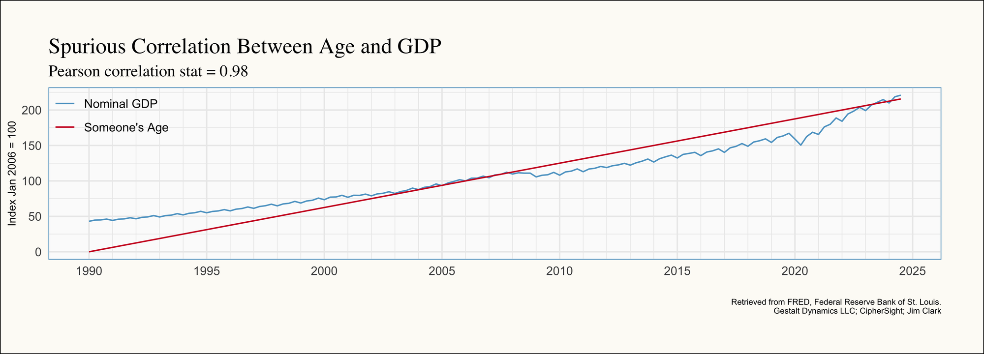
One of the simplest ways to de-trend data and avoid this type of confounding factor is to work with differences. This is why so many reports and metrics are expressed in terms like "Year-Over-Year" (YoY), "Quarter-Over-Quarter" (QoQ), or "Month-Over-Month" (MoM). By transforming the time series into these terms, we largely eliminate the trend component, and poof! Any apparent correlation disappears. In our example, our correlation coefficient is undefined because age increases at a perfectly constant rate; This leaves no variability (standard deviation) for a meaningful correlation calculation.
Observations After Re-evaluating the Correlation Matrix
After de-trending each time series using Year-Over-Year measures, the correlation matrix looks a lot more believable since we would not expect there to be such a strong correlation between all of the variables all at once:
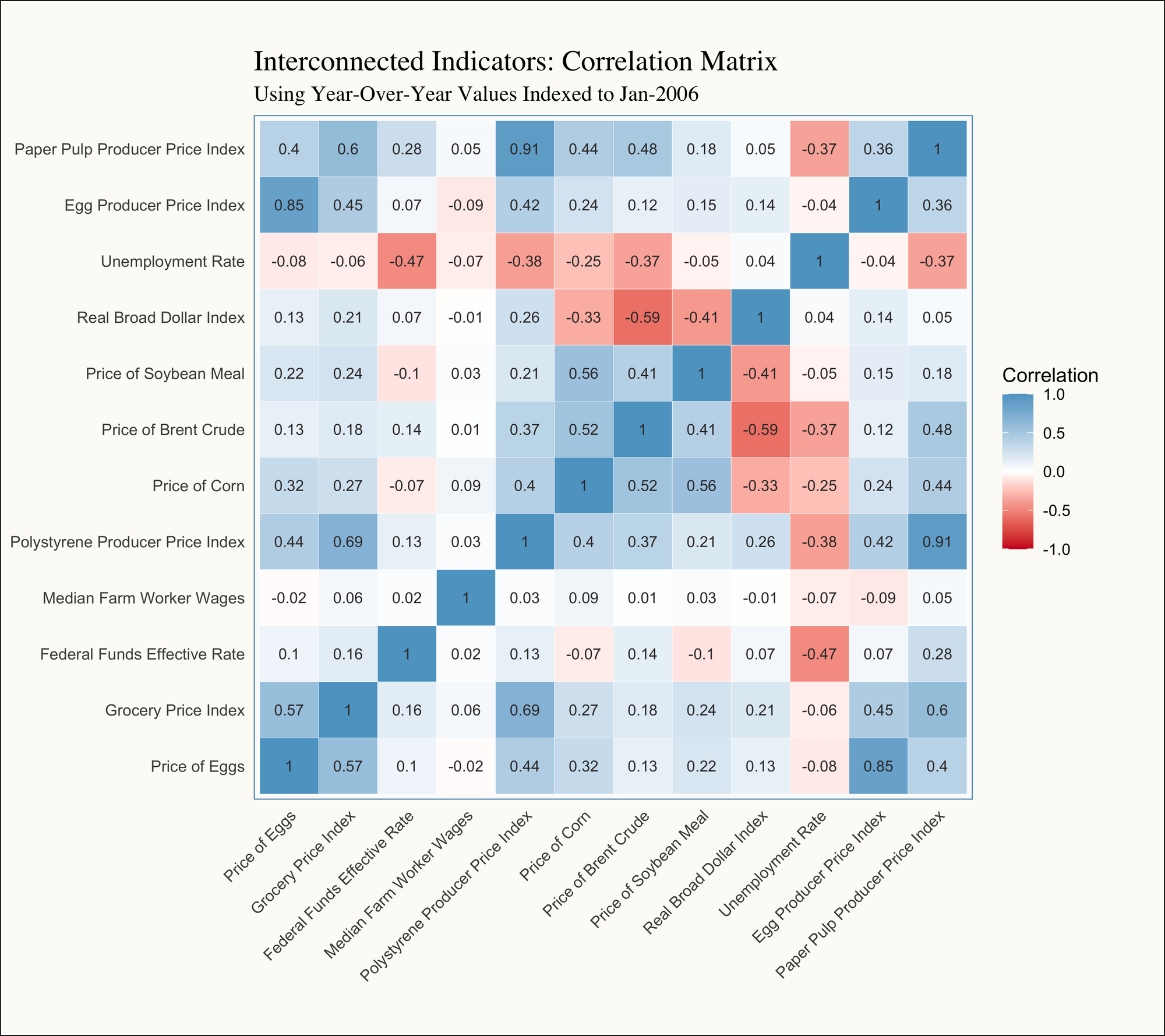
- Egg Prices: Looking at the Price of Eggs line—the dependent variable we’re ultimately trying to explain—we observe a stronger relationship with the Egg Producer Price Index (PPI) compared to the Grocery Price Index (the "Food at Home" component of the Consumer Price Index). This aligns with our earlier observations that egg prices are more heavily influenced by supply shocks than by generalized inflationary pressures (See Part II). This distinction highlights the unique dynamics driving egg prices within the broader grocery market.
- Commodity Substitutes: We also observe a strong relationship between the PPI for Paper Pulp and Polystyrene, as well as the prices of corn and soybean meal. This suggests that these materials and feed stock are likely substitutes within the supply chain, hinting at shared demand dynamics where shifts in the price or availability of one material may influence the use of the other.
- Real Broad Dollar: The prices of corn, soybean meal, and Brent crude (oil & gas) are negatively correlated with the Real Broad Dollar Index. As a quick refresher, the Broad Dollar Index serves as a proxy for the strength or weakness of the U.S. dollar. When the index decreases (indicating a weaker dollar), exports tend to rise. Increased exports of commodities like corn and soybean meal reduce domestic supply, driving up their prices. This relationship underscores the interplay between currency strength and commodity markets.
Understanding Lag Effects
An additional insight that stands out is that the prices of corn and soybean meal are not as strongly correlated with egg prices as one might initially expect, with correlation coefficients of 0.32 and 0.22, respectively. However, it’s important to remember that even though we’re using Year-Over-Year measures, all correlations are being calculated contemporaneously—that is, for values occurring in the same month. Given our monthly observations, this means we’re only capturing immediate relationships and not accounting for potential lag effects.
Referring back to our generalized supply chain diagram, it’s reasonable to assume there’s a delay between changes in the price of inputs, such as corn, and their eventual impact on the price of eggs. This suggests that further analysis incorporating time lags might reveal stronger, more meaningful relationships between these variables. As such, we can look at one more correlation matrix that aims to evaluate if there is a lag effect between corn and eggs we need to account for:
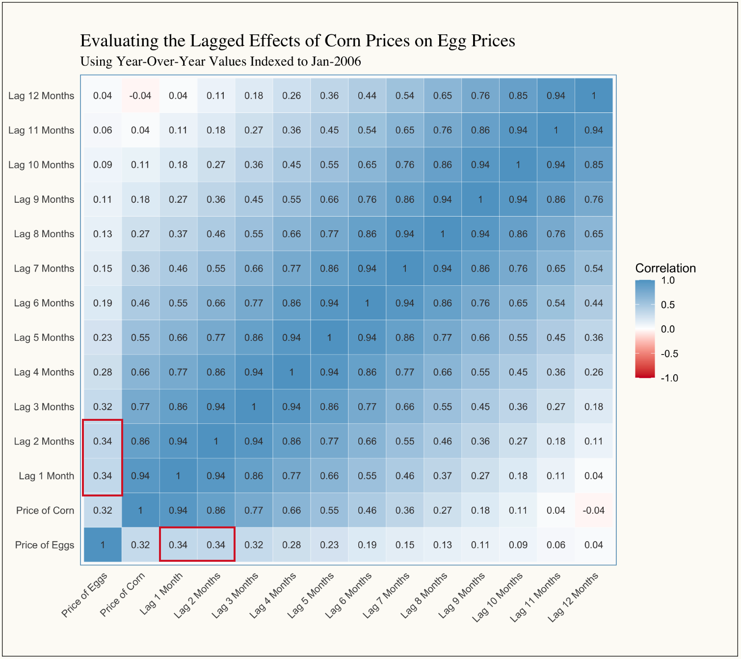
Here, we observe that the correlation coefficient increases slightly from 0.32 to 0.34. While this small change might hint at the overall velocity at which inputs move through the supply chain (in this case suggesting that it takes one to two months for the price of corn to effect the price of eggs), the result is too minor to justify a follow-up at this stage.
One notable observation from this correlation plot, however, is that the price of corn is strongly correlated with its own past values. As discussed in the Depths of Insight post, this is a classic example of autocorrelation—a phenomenon common in time series data.
Conclusion
By integrating box plots with the fundamentals of correlation, we’ve taken a significant step toward exploring the dynamics underlying egg prices and the broader commodity landscape. We’ve seen how quickly a spurious relationship can appear when time trends come into play—and how critical it is to address those trends, often by de-trending or looking at lagged effects, before drawing firm conclusions.
Looking ahead, we’ll be diving deeper into time series modeling in Part VI, focusing on how to handle phenomena like autocorrelation and building robust regression models. By doing so, we’ll move from simply describing relationships to being able to explain (diagnostic analytics), and thus predict them (predictive analytics)—further refining our insights into what truly drives the price of eggs. Stay tuned!


