Inflation, Supply & Demand, and Eggs: Part IV

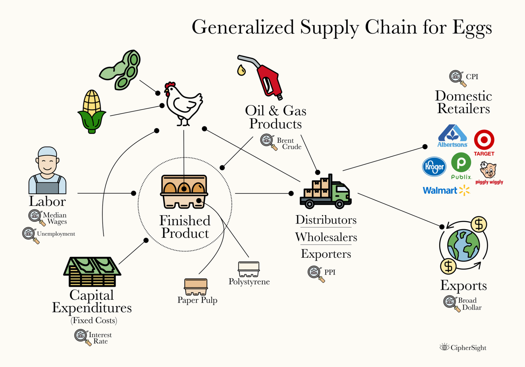
By this point, we've benchmarked egg prices against inflation (Part I), examined several supply shocks in the history in the price of eggs (Part II), and used all these accumulated insights to form Part III, where we outlined a generalized supply chain for eggs and compiled a basic Data Dictionary that highlight some FRED (Federal Reserve Economic Data) data that feels pertinent to include in this initial analysis. The stage is now set to put analytics into practice.
The Depth of Insight
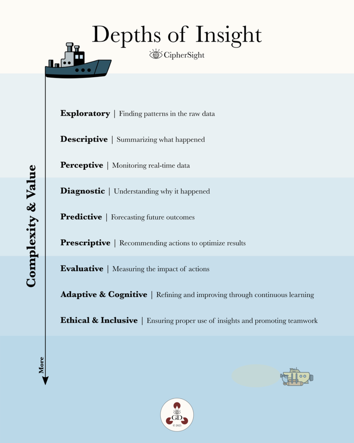
In my previous post about the Depths of Insight, I outlined some of the various types of analytics and used the metaphor of passing through them with a submarine. If you haven't already, I encourage you to read that post before proceeding. If you have, here's a quick recap anyway!
Box Plots
Today in Part IV, we'll move more into the realm of Descriptive Statistics and I can think of no better place to start than with Box Plots. For reference, here's an example of what a Box Plot looks like some of the key terms, and the original time series presented in Part I for reference:
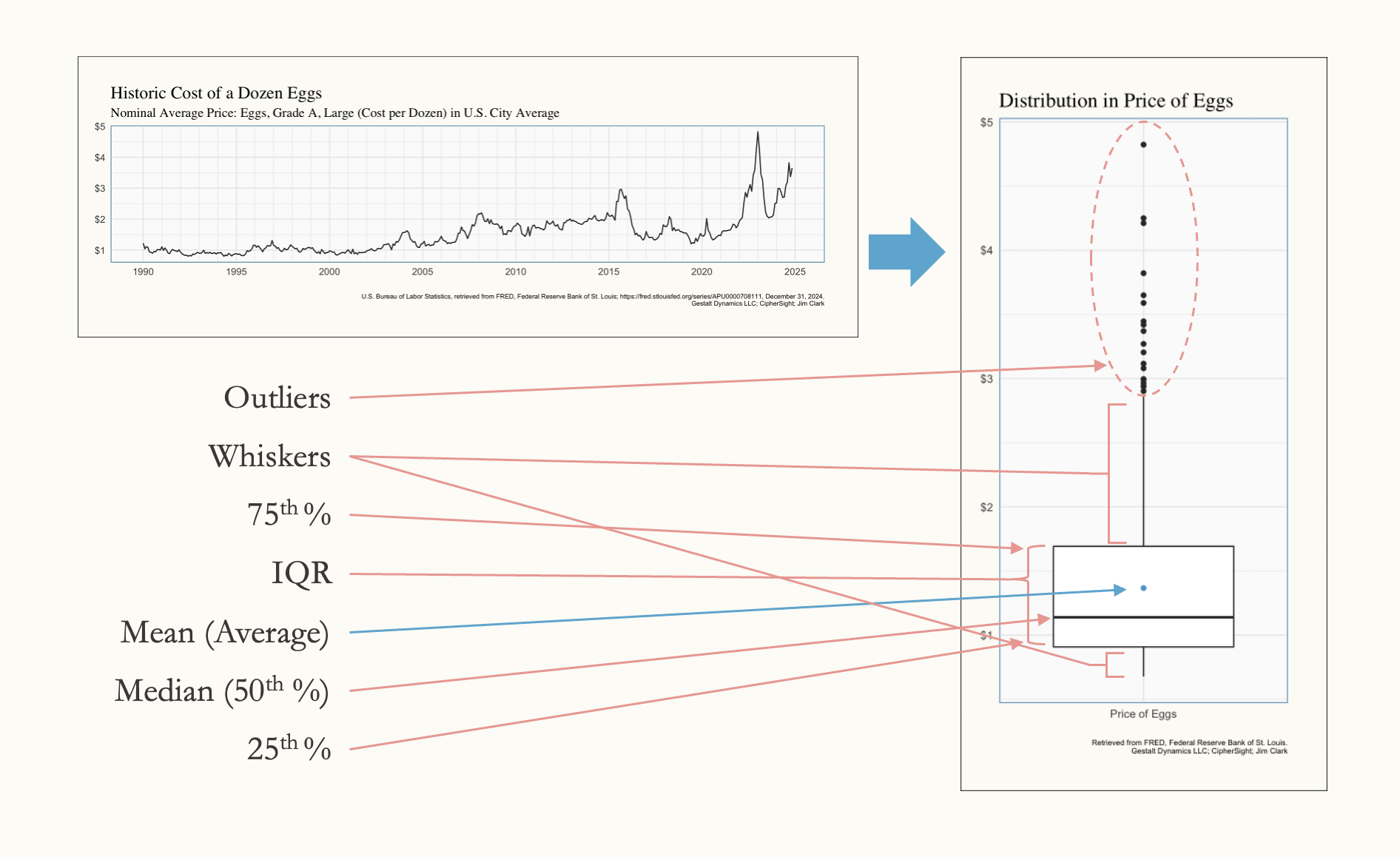
Usually, when presented with a series of observations, the first (and often last) type of summary statistic that gets applied to it is the average (mean). But that leaves out a lot of perspective. The mean tells you what’s typical overall, but it doesn’t reveal how spread out the data is, whether there are significant outliers, or how the values are distributed. This is where the box plot comes in—it adds depth and context to the story the data is trying to tell. By showcasing the median, quartiles, and range, along with highlighting outliers, the box plot paints a more nuanced picture of the data. It shows not just where the center lies, but also the variability, symmetry, or skewness in the observations. This allows us to move beyond averages and start asking meaningful questions about the patterns and anomalies within the data.
Also, one additional note on the Whiskers and the Outliers: the whiskers will usually extend to the maximum / minimum values unless there are outliers. When an observation is above (in the case of a high value) the 75th percentile + 1.5x the interquartile range (IQR)—or below the 25th percentile - 1.5x the IQR in the case of a low value—the observation is considered an outlier.
The More the Merrier
Box plots become especially powerful when placed side-by-side in thoughtful and meaningful ways. In our case study, we’re working with a time series where each underlying observation represents a month’s value. This means that in our box plot, we’ve entirely collapsed the dimension of time. Since inflation typically drives prices upward over time, we can reasonably infer that the higher-value observations are more recent than the lower ones, even without referencing the original time series. This assumption undermines the chart’s effectiveness by obscuring temporal trends.
To address this, we can reintroduce the time dimension by plotting the box plots along an x-axis that groups observations into "bins" of time. For instance, we can segment the data into five-year intervals, allowing us to preserve the insights of the box plot while highlighting how distributions have shifted over time. This approach adds valuable context, making it easier to interpret both the variability and the temporal trends in the data:
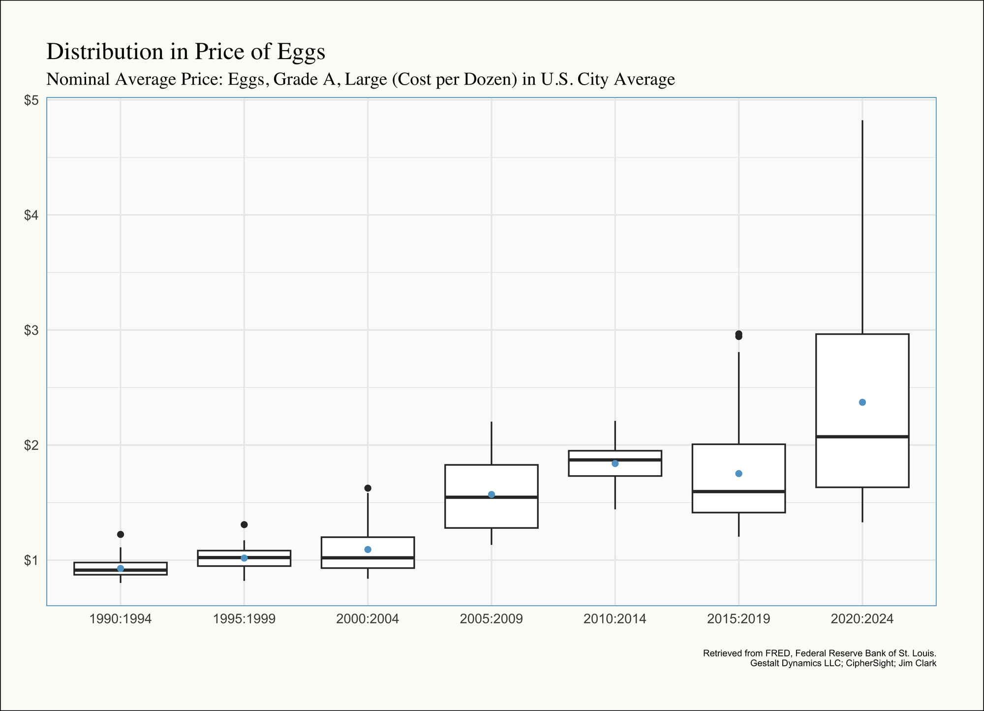
By reintroducing the time dimension, this visualization builds on our earlier work, offering a more nuanced view of how systemic disruptions shape long-term price trends. As you can see, over the past few decades, egg prices have transitioned from relative stability to marked volatility, as reflected in the box plots grouped by five-year intervals. In earlier periods, such as 1990–2004, and between 2010–2014, prices were consistent (albeit higher in the later period), with small interquartile ranges and minimal outliers, indicative of stable supply and demand dynamics. There's a deep dive into how and where I think things went off the rails in Part II so I won't rehash all the anecdotes here, but the short and sweet of it is due to Bird Flu and the rising cost of inputs.
The Importance of Indexing
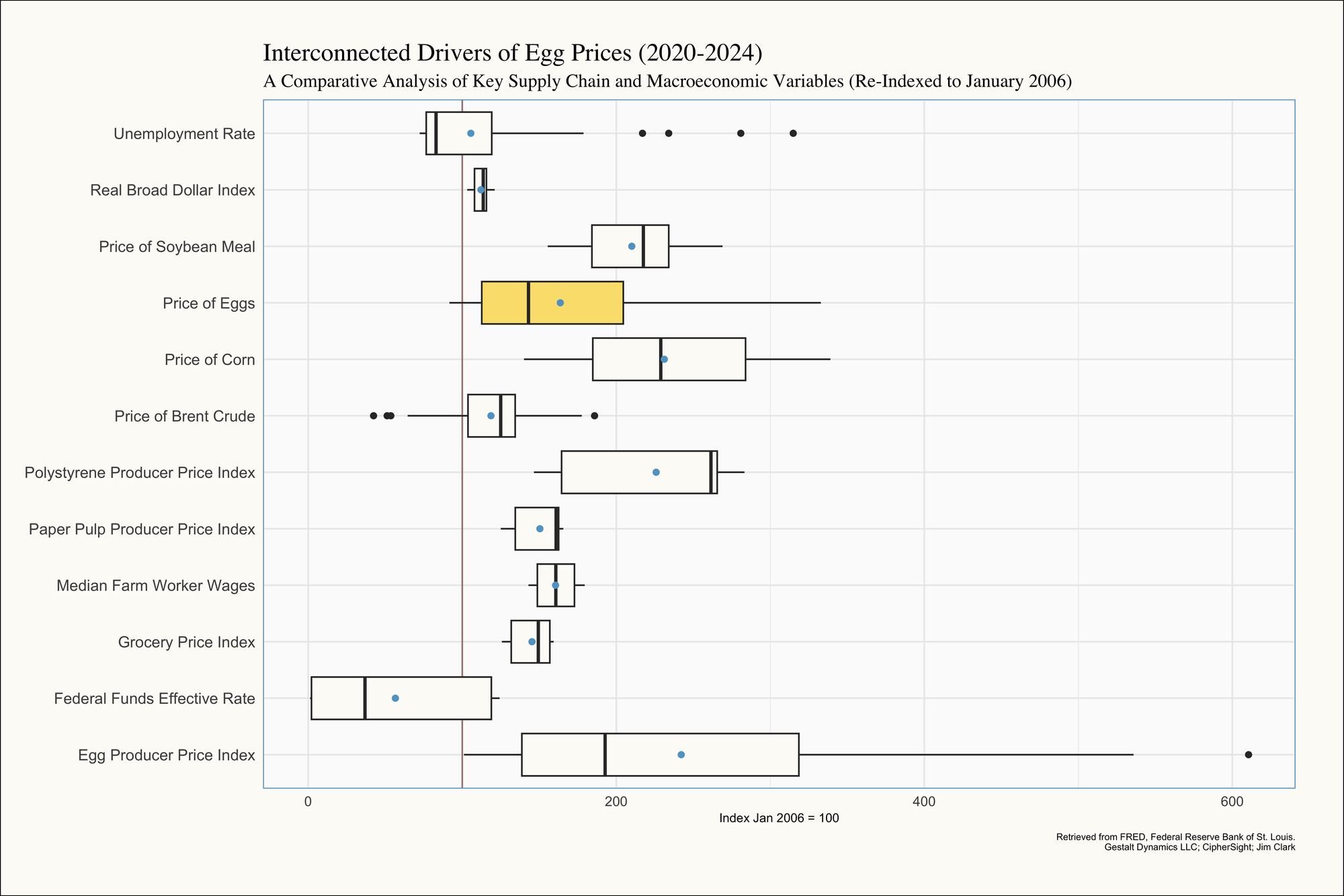
Another key point we’ll revisit is why we took the time to re-index the time series earlier—because comparative box plots are an ideal application for this approach. If we had used the original units, comparing the price of eggs and the price of corn in the same box plot would have been impractical. While both are measured in dollars, average egg prices rarely exceed $4 per dozen, whereas corn prices can reach nearly $350 per unit in some months. This drastic difference in scale would render any direct comparison meaningless. By re-indexing all potential independent variables to a common baseline (January 2006 in our case) we've eliminated the issue of differing scales. This adjustment allows us to place the box plots side-by-side and unlock new insights by making meaningful comparisons:
Key Observations
- Egg Prices: The Price of Eggs (highlighted in yellow) shows a wide interquartile range (IQR), and thus high variability compared to many of the other variables, demonstrating the significant price fluctuations we've been discussing between 2020-2024.
- Feed Costs: The Price of Corn also exhibits substantial variability, with a large IQR, reflecting its volatility as a commodity driven by external factors like biofuel policies and global demand (as discussed in Part II). Meanwhile, the Price of Soybean Meal (another key feed input) shows notable variability but, but per the tighter IQR is more stable compared to corn prices. Additionally, the median (black lines in the middle of the boxes) and mean values (blue dots) are to the right of the median and mean values of the price of eggs, suggesting that these prices are rising faster than the price of eggs. This also reinforces the idea that these feed prices are Leading Indicators; This will be explained further in a subsequent post.
- Packaging Costs: The Paper Pulp Producer Price Index has a much narrower distributions than the Polystyrene Producer Price Index, suggesting more predictable costs over time. However, for both materials, the medians are highly skewed towards the top of the distributions. Checking the time series shown in the dashboard featured in In Defense of Shiny Things show these prices skyrocketing starting in 2021.
- Volatility in Energy Prices: The Price of Brent Crude, representing energy costs, shows a tighter range, but has several outliers, reflecting its sensitivity to geopolitical events and market forces. This variability likely contributes to transportation and production costs for eggs.
- Macro-Level Indicators: The Unemployment Rate and Real Broad Dollar Index display relatively narrow IQRs, indicating more stability over time compared to the commodity prices. However, small fluctuations in these variables can still have significant downstream effects (e.g., labor costs, export competitiveness).
- Grocery and Producer Price Indices: The Grocery Price Index is relatively stable compared to the Egg Producer Price Index, which has a wider IQR and outliers, reflecting the unique challenges faced by egg producers in recent years.
Conclusion
I hope you’ve gained a deeper appreciation for box plots and their power during the descriptive analytics phase. After breaking down how to interpret them, we revisited our original time series by segmenting it into five-year increments, making the trends much easier to visualize and understand. From there, aligning all our variables to the same index allowed us to compare distributions side-by-side. This exercise not only helped us uncover key patterns but also set the stage for forming hypotheses and exploring connections that we’ll dive into further in Part V.
On a personal note, I want to thank everyone for the kind words, feedback, and encouragement I’ve received throughout this series. It’s been incredibly rewarding to share this journey with you, and I’m grateful for your support!


